
In part 1 of this series, I reviewed the what Huddle is, and well as listing its features and capabilities. In this post, I review what happened when I signed up for the 14-day free trial of Huddle.
1. Signing up was easy – name, email address, desired user name (and it looked up to see if it was available too), and password. After submitting the sign up form, I received an activation email almost immediately. I copied the activation code into the browser window, and was in.
2. When Huddle opens for the first time, it goes to your dashboard. There were two first-time-user tips visible on the screen – what I call the Easy First Steps strategy for user adoption. The largest told me what the dashboard was (“The dashboard summarizes activity across all of the workspaces in which you participate“), and offered a video on getting started, or a link to my first workspace. The second tip pointed out my list of workspaces, on the left hand side.
3. The video was 3 minutes long. It gave a good overview of the service – talking through the various parts of the dashboard for example. However, in terms of style, my preference would be for the presenter to touch on each area first – “here’s the different areas on screen” – and then drill into each area in turn – “the ‘Files Awaiting Approval’ allows you to … .” The video finishes with a great summary line: “So your dashboard becomes your one-stop-shop to see everything relevant to you, and to get all your work done from one central location in Huddle.“
4. When a new Huddle account is created, a first workspace is automatically created for the user. The one in my account was called “Michael Sampson’s workspace.” When clicking into the workspace, a quick overview shows, including a definition of a “workspace” – “a secure space that you can share with others and use to manage a project, team or client relationship.” As with the first-time-user tips on the dashboard, a list of similar easy first steps are offered when clicking into the workspace. There is some visual magic going on too, to link a hover over (on say “Invite People”) with the “People” tab across the top of the screen. In other words, Huddle is nudging you in the direction of safety – that once you close the “Get Started” box, you will be able to find all the links later. Two linkage points were inconsistent – hovering over “Support Center” in the box highlighted “Support Center” along the top, complete with a yellow highlight. Hovering over “upgrade your account” in the box highlighted “Michael Sampson (upgrade)” across the top, but without the yellow highlight.
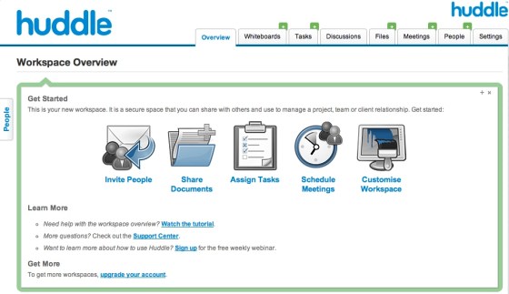
(If you open this full-screen, you’ll be able to see more detail.)
5. The workspace overview pane shows two things: the user’s calendar (with tasks and meetings ONLY from the current workspace), and the what’s new area. It is not possible to click on a day in the calendar, and add a meeting time. You have to click across to the “Meetings” tab to do that.
6. When clicking into one of the tabs, a first-time-user receives an invitation to watch the related tutorial. Eg., click into Discussions, there’s a “Huddle Discussions” video on offer. This is good – contextual help, immediately available, easy to get rid of.
7. The placement of the “New (something)” button is inconsistent. For some areas, it’s on both the right hand top and sides for whiteboards, discussions, files, and people. For meetings, it’s only on the top right hand side, not on the bottom. Tasks are different again. You have to enter the task details in a quick entry form, before being able to add it. Under settings, for Teams, the button is on the bottom left hand side, and the same for invitations. I’m not sure on the purpose for this differential placement – I’d like to see greater consistency across the different tools.
8. It’s easy to invite new people. Click the “New Invitation” button, write in their email addresses (or look up against your Address Book), and go.
9. When a non-Huddle user receives an invitation to join a workspace, by virtue of them clicking the link and creating a Huddle account, they have accepted the invitation. It does not appear possible to view the invitation, create an account, and then decline the invitation. Having said that, there is a “Leave this workspace” link at the bottom of the workspace dashboard page, and when clicked, the user can eject themselves. To get back in, they have to be invited again.
10. With the free package (14-day free trial), each user can create only one workspace. To explore multi-workspace behaviour, you have to upgrade to the “Small Team Package,” which allows up to 5 workspaces. Since the 14-day free trial expires after 14-days (funny that), I’d like to see Huddle offer the ability for users to create up to 5 workspaces. This would allow new users to get a better sense of the possibilities, and thus increase the likelihood that they’ll stay, without causing a lot of extra cost on Huddle. As far as I’m concerned, keep the 100MB storage limit – but allow users to create more than one workspace.
10.5 Huddle does offer this, in a way. If you give them your credit card number, and enter a promotion code that they show on your dashboard, you can get 1 month free with any of the plans. I guess that gives Huddle what they need – confidence that one person isn’t abusing the free trial by signing up repeatedly – and it gives real prospects what they need – the option of trying out a fuller set of capabilities at no charge.
11. Meetings created in workspaces aggregate to each user’s “Dashboard” page, assuming that they are being invited to the meeting. When you create a meeting, you can say that everyone in the workspace should see it, or just a few people, or even some outside people who are invited to just that meeting.
12. There were places in the interaction design where I would have preferred pop-up dialog boxes rather than the re-drawing of the screen. For example, when creating a meeting, the default time zone was set to GMT. When I clicked to change it to NZT, the screen re-drew, and once I’d made the update, I had to restart the set up of the meeting. Even though such a thing may not happen often, it’s annoying when it does happen.
13. I like the idea of the dashboard page – a snapshot of things that are time-sensitive (“files awaiting approval” and “my calendar”), to enable a user to get a complete view of current outstanding tasks or upcoming meetings. It also provides a sense of time-in-motion, with things that have happened recently – to inform – and reminders about the specific tasks and files I’m working on. Finally, there is a list of the workspaces I’m involved in, for easy access.
14. There’s a lot here – much that I haven’t reviewed yet. More later.
Categories: Culture & Competency, Tools & Technologies
